Tutorial: Hanging Your New Artwork

So you’ve bought a gorgeous piece of art for your home, but you’re not sure how to hang it. Here’s what to do!

HOW HIGH?

The rule of thumb is that the centre of the work should always be at eye level. This will allow everyone to fully appreciate the beauty and detail of the work, enhance the balanced look of your room, and it will also give the impression that you’ve hired a professional interior decorator!

Art galleries around the world use a standard formula based on the eye level of the average adult when hanging two-dimensional artwork. Consistency is key!

THE BASICS:

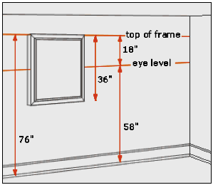
The standard eye level height is generally between 56 to 60 inches from the floor (some even go as high as 62 these days), so you can choose whatever best matches the height of the people in your environment. Whatever you choose, it should remain the same for each piece.

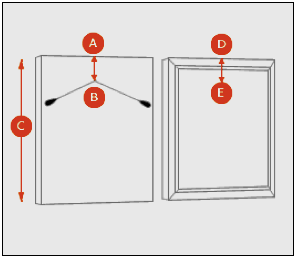
The height of artwork, including the frame, is measured in order to determine the exact centre point measurement. For example, a work that is 24″ high will have a 12″ centre point, and a 36″ piece will have an 18″ centre point, and so on. (see diagram, C) Each piece will be hung so that the centre point is always at eye level, no matter how small or large the artwork. (There are other formulas, but this one is pretty fool-proof.)

The other important measurement you need is the distance of the stretched wire from the top of the work. The ideal is 3″ but many artists and framers don’t consider this when attaching wire to the back of an artwork. (see diagram, A-B)

THE FORMULA:

(This tells you where to place the picture-hanging hook on the wall if using a 58 inch eye level format.)

  • For a work measuring 24″ with a 3″ wire allowance, place the hook at 67 inches from the floor:  (24 ÷ 2) + 58 – 3  =  67 inches
  • For a work measuring 36” with a 4” wire allowance, place the hook at 72 inches from the floor:  (36 ÷ 2) + 58 – 4  =  72 inches

NOTE:  In cases where works are hung in groups, the centre of the grouping then sits at eye level.

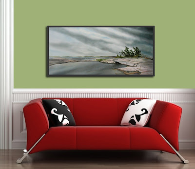
Artwork Credits: Oncoming Storm by Brent Trach, (painting not to scale)
Tutorial: Hanging a Show

LaRiviere_Schlein_Exhibition-5

Happy New Year Everyone! My first post of 2015 is a tutorial. This morning I received an email from an artist in North Bay asking for advice on how to hang her upcoming solo exhibition. Hanging your own show can be a daunting task, so I’ve decided to share my email reply with you. Hope this helps!

Her questions had to do with spacing between the works, consistency where size is concerned, options for variations, and whether any of it matters. While there really are few hard rules, there is a general process for hanging exhibitions that I like to follow. Here are a few tips:

  1. Content generally matters more than size in groupings, but if you have a mixed selection of significantly larger or smaller works, they could be grouped together. It’s a matter of personal preference.
  2. The spacing depends on the number of artworks versus available wall space.
  3. To begin, lay all the work on the floor leaning against the walls in the general location where you think it should be hung.
  4. Next, stand back and examine the whole show, i.e. spacing, the flow from the gallery entrance, good juxtapositions, bad juxtapositions, obvious clashes, etc., then nudge and shuffle accordingly until you are happy with it. (This part takes the longest and is a creative process in itself. It’s a lot of fun.)
  5. And finally, if the work is relatively uniform in size, start hanging it sequentially from one end of the wall to the other. If there is a large centre piece anywhere on one particular wall, then you could start with it first, then work outward to the right and left.

Every show is unique, and there is much room for creativity in how it is displayed. A little Fen Shui may even be useful in avoiding “blockage.” For example, there could be a situation where the image of a woman in profile is placed at the end of a wall with her facing into the corner. How would the feeling of the piece change if she is were looking into the room with her back to the corner instead? In another situation, what if she is not in a corner, but “facing” a particular work of art beside her? If that piece were about pollution and decay, having her “back” to it could convey a subtle but different reading that may be pertinent to the exhibition as a whole. So you see, there is much to think about.

One thing I like to point out to students (whether in the creation of art, or hanging it on a wall) is that in western culture we read text from left to right. This “habit” therefore informs how viewers move through visual imagery, although they may not be aware of it, so consider flow and “punctuation.” It is one of the cornerstones of the Elements and Principles of Design.

And finally, don’t forget to use the formula for hanging artwork at eye level. Here’a a tutorial that I created for Art on Main Downtown Artists’ Collective in 2011. So good luck, and above all, have fun!

Credits: All photos are of Lonnie Schlein’s 2012 exhibition at the WKP Kennedy Gallery. I took some quick iPhone shots while installing the show, and Liz Lott was the official photographer for the exhibition’s opening reception. Visit Lonnie Schlein’s official website.

Tutorial: When to Choose Monochrome

In my previous post I talked a little about why a black and white version of a photo is sometimes preferable to the original colour version. Below is an example (click on the thumbnails to enlarge) and explanation of a few handy points to keep in mind in your own photography.

In this photo taken at my niece’s outdoor wedding, while the bride and her friends look quite lovely in colour, there is a lot of stuff going on around and behind them, some of it in strong primary colours. The result is a busy composition, which has the unwanted effect of robbing attention away from the three pretty faces in this impromptu portrait. While most photos benefit from a little cropping, in this case it would not eliminate the red lanterns above their heads, nor the blue tent awning. The middle woman’s yellow sash also interacts with the other colours, making them even more prominent. This is a classic case where converting to monochrome makes all the difference in the world, and combined with a little cropping, the shift in focus is directed to right where it needs to be – on their smiling faces.

I was asked today if my camera has a monochrome setting, and whether I use it. Yes it does, and no I don’t use it. Professionals suggest that you always shoot in colour, and make the decision later during post-editing. This makes sense because just as some photos are more impressive in black and white, others don’t work as well and actually NEED to be in colour. This is what I’ve been studying and practicing all summer, and the results have taken my work to a whole new level.

Questions to ask yourself when assessing a photo:

  • What is the most important thing about this photo?
  • What should be emphasized?
  • What should be de-emphasized?
  • Will cropping help to eliminate extraneous objects or people that are distracting from the intended subject of the photo?
  • Am I following the rule of thirds?
  • Are there simple colour harmonies enhancing the composition, or crazy random colours everywhere undermining the focal point and subject of the photo? (Note: sometimes it’s just one harsh colour off to the side that’s throwing everything off.)
  • Would converting to monochrome make this photo really pop? Try it. If it’s not working, switch it back to colour.

Because my background is in fine art, and I’ve studied colour theory and the elements and principles of design, I know that it’s an advantage for me where photography and photo-editing are concerned. Still with a little knowledge, and a discriminating eye, anyone can aspire to make their photos the very best that they can be!

In closing, I would like to add that photographers using older, traditional materials and methods (developing photos in chemical baths in the darkroom) utilized many techniques to improve their final results. They played with contrast, dodged or burned areas in order to compensate for over or under-exposure, and had a variety of darkroom tricks to make their images great. Today’s professional photographers use photo-editing software (digital darkrooms) such as Adobe’s Lightroom or Apple’s Aperture to accomplish the same thing and more. The magic is indeed alive and well in today’s digital world, and I love it!

While this post has focused primarily on situational portraits, my previous post examines the monochrome landscape.

I would love to hear about your work, challenges, and triumphs in photography, so please feel free to leave a comment! ML

%d bloggers like this: