Naked Truths (Part 2)

MOODY, EMOTIONAL WORK is the core of what drives me as a content creator. I think, I write, I create in various media, yet the same aesthetic values invariably lead to similar processes and conclusions. There is only one muse.

My long-standing enthusiasm for digital technology has been a rewarding and fruitful journey. In 2012 I had a solo exhibition of artworks created exclusively on an iPhone. The device seems limitless in its creative potential. One of my favourite apps is Hipstamatic, which I’m currently using to replicate the look and feel of old daguerreotypes and tintypes. While the results are engaging in their own right, my usual habit is to push and explore – thus branching off in parallel directions, but still retaining the emotional impact of the original images.

As I explained yesterday in my blog post essay, in addition to the rich, imperfect appearance of daguerreotypes, what intrigues me most about early 19th century portraiture is that it was able to dissolve the protective masks behind which most people conceal their inner selves. This was due to the super-long exposure times required. Nobody said “cheeeeese.” They just sat or stood motionless until the photographer signalled that the process was complete. So without the aid of a practiced “camera smile” to camouflage their true emotions, the camera ultimately captured a more “honest” portrait.

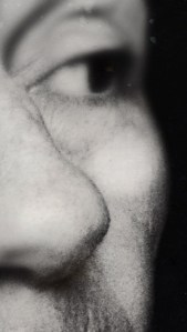
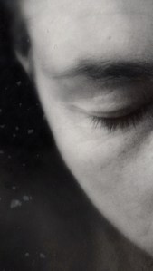
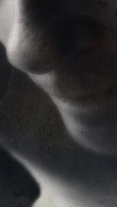
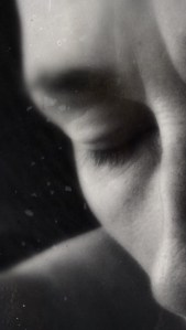
AS AN ARTIST, I have often used myself as the model in my work because the themes originate from my own complicated, inner experiences. As such, using the tintype approach for this emerging body of work is the right fit because it conveys the mood so perfectly and unapologetically. To be genuinely authentic is to embrace and celebrate the beauty of our imperfect selves, and the tintype seems particularly suited for this purpose.

Applying a technique I’ve previously used to deconstruct and abstract photos of orchids, the series below (including the three images at the top of this page) was created by magnifying selected tintype images in order to achieve new and interesting compositions. The resulting portraits are confined to only partial views of the face, but enough is still visible to retain a sense of intimacy and the mood which informs all of the works in the Naked Truths Project. It will be exciting to see how all the pieces fit in the final completed ensemble.


Tutorial: When to Choose Monochrome

In my previous post I talked a little about why a black and white version of a photo is sometimes preferable to the original colour version. Below is an example (click on the thumbnails to enlarge) and explanation of a few handy points to keep in mind in your own photography.

In this photo taken at my niece’s outdoor wedding, while the bride and her friends look quite lovely in colour, there is a lot of stuff going on around and behind them, some of it in strong primary colours. The result is a busy composition, which has the unwanted effect of robbing attention away from the three pretty faces in this impromptu portrait. While most photos benefit from a little cropping, in this case it would not eliminate the red lanterns above their heads, nor the blue tent awning. The middle woman’s yellow sash also interacts with the other colours, making them even more prominent. This is a classic case where converting to monochrome makes all the difference in the world, and combined with a little cropping, the shift in focus is directed to right where it needs to be – on their smiling faces.

I was asked today if my camera has a monochrome setting, and whether I use it. Yes it does, and no I don’t use it. Professionals suggest that you always shoot in colour, and make the decision later during post-editing. This makes sense because just as some photos are more impressive in black and white, others don’t work as well and actually NEED to be in colour. This is what I’ve been studying and practicing all summer, and the results have taken my work to a whole new level.

Questions to ask yourself when assessing a photo:

  • What is the most important thing about this photo?
  • What should be emphasized?
  • What should be de-emphasized?
  • Will cropping help to eliminate extraneous objects or people that are distracting from the intended subject of the photo?
  • Am I following the rule of thirds?
  • Are there simple colour harmonies enhancing the composition, or crazy random colours everywhere undermining the focal point and subject of the photo? (Note: sometimes it’s just one harsh colour off to the side that’s throwing everything off.)
  • Would converting to monochrome make this photo really pop? Try it. If it’s not working, switch it back to colour.

Because my background is in fine art, and I’ve studied colour theory and the elements and principles of design, I know that it’s an advantage for me where photography and photo-editing are concerned. Still with a little knowledge, and a discriminating eye, anyone can aspire to make their photos the very best that they can be!

In closing, I would like to add that photographers using older, traditional materials and methods (developing photos in chemical baths in the darkroom) utilized many techniques to improve their final results. They played with contrast, dodged or burned areas in order to compensate for over or under-exposure, and had a variety of darkroom tricks to make their images great. Today’s professional photographers use photo-editing software (digital darkrooms) such as Adobe’s Lightroom or Apple’s Aperture to accomplish the same thing and more. The magic is indeed alive and well in today’s digital world, and I love it!

While this post has focused primarily on situational portraits, my previous post examines the monochrome landscape.

I would love to hear about your work, challenges, and triumphs in photography, so please feel free to leave a comment! ML

%d bloggers like this: